Coursera Design Challenge
Role: UX Designer and UX Researcher
Objective: Design an app for parents to purchase and sell children’s clothing
Challenge
People need a better way to purchase and resell clothing for their fast growing children.
Goal
Develop an intuitive app where users can easily purchase pre-owned children’s clothing, while also providing a seamless way to sell or donate outgrown items.
Approach
Research
Empathize
The overall goal of this project was to create an app to purchase and resell children’s clothing, so I decided my goal would be to create an new app that solves common issues.
After defining my survey goals and target participant characteristics, I sent out surveys to start collecting data.
Empathy Maps
After reviewing the survey responses, I created empathy maps to organize and understand my participants’ thoughts and experiences. This revealed patterns that users have when shopping for and selling children’s clothing.
Pain Points
When it comes to online purchasing, many users feel:
Worried because they can’t try clothes on
Hesitant due to unknown quality
Doubtful because of limited size information
Overwhelmed by too many options
When it comes to online selling, many users feel:
Annoyed because it takes too long
Discouraged because it’s too much work
Worried about unhappy buyers
Intimidated by the complicated processes
Personas
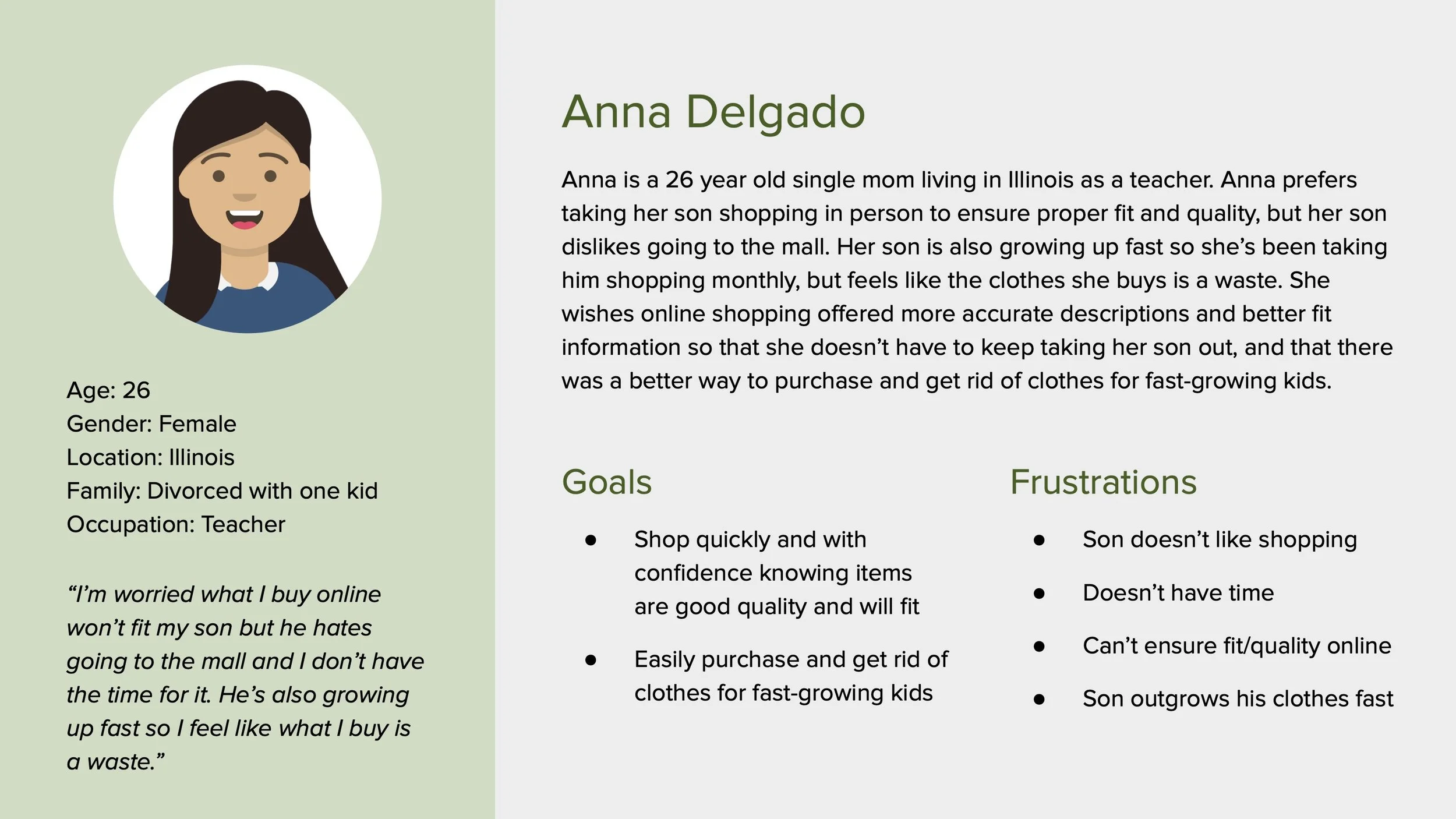
I created personas along with problem statements and user stories to further organize and identify patterns. User journey maps were created afterwards to illustrate what the user currently goes through to achieve their goals. This helped identify possible opportunities for improvement.
Competitive Audits
I then performed competitive audits to identify additional design gaps and opportunities.
Gaps:
Some apps are too busy
Apps are only in English
Low quality images
No personality
Opportunities:
Offer a clean site
Offer more language options
Use high quality images
Use strong branding
Define
Value Propositions
With the pain points and gaps in current apps I identified from the last stage, I created a categorized list of potential product features and benefits to include in the new app. I then connected them to my personas and narrowed the values down to the most important ones. This technique helped me craft value propositions for each of my personas which ultimately revealed which key features to include.
Goal Statements
Using my problem statement for Anna, the primary persona, I created goal statements to uncover the ideal solution for my product.
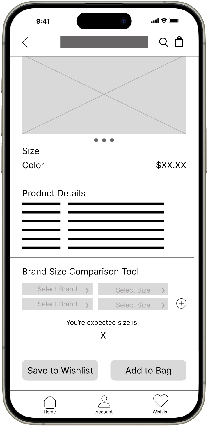
“Our e-commerce app will let users purchase clothing for their children quickly and with confidence which will affect parents by allowing them to try items on before purchasing, utilize a brand size comparison tool, browse product recommendations, and send back items once their children outgrow them. We will measure effectiveness by analyzing the number of returns, purchases made from recommendations, and clean-out bag requests.”
How Might We’s, Rapid Sketching, User Flows, Storyboards, and a Sitemap
After defining the problem, I used multiple techniques, including How Might We’s, Rapid Sketching, User Flows and Storyboards, to brainstorm solutions. Additionally, I developed a sitemap to structure the app’s organization which helped me further visualize the product.
Wireframes
Paper Wireframes
Digital Wireframes
Ideate
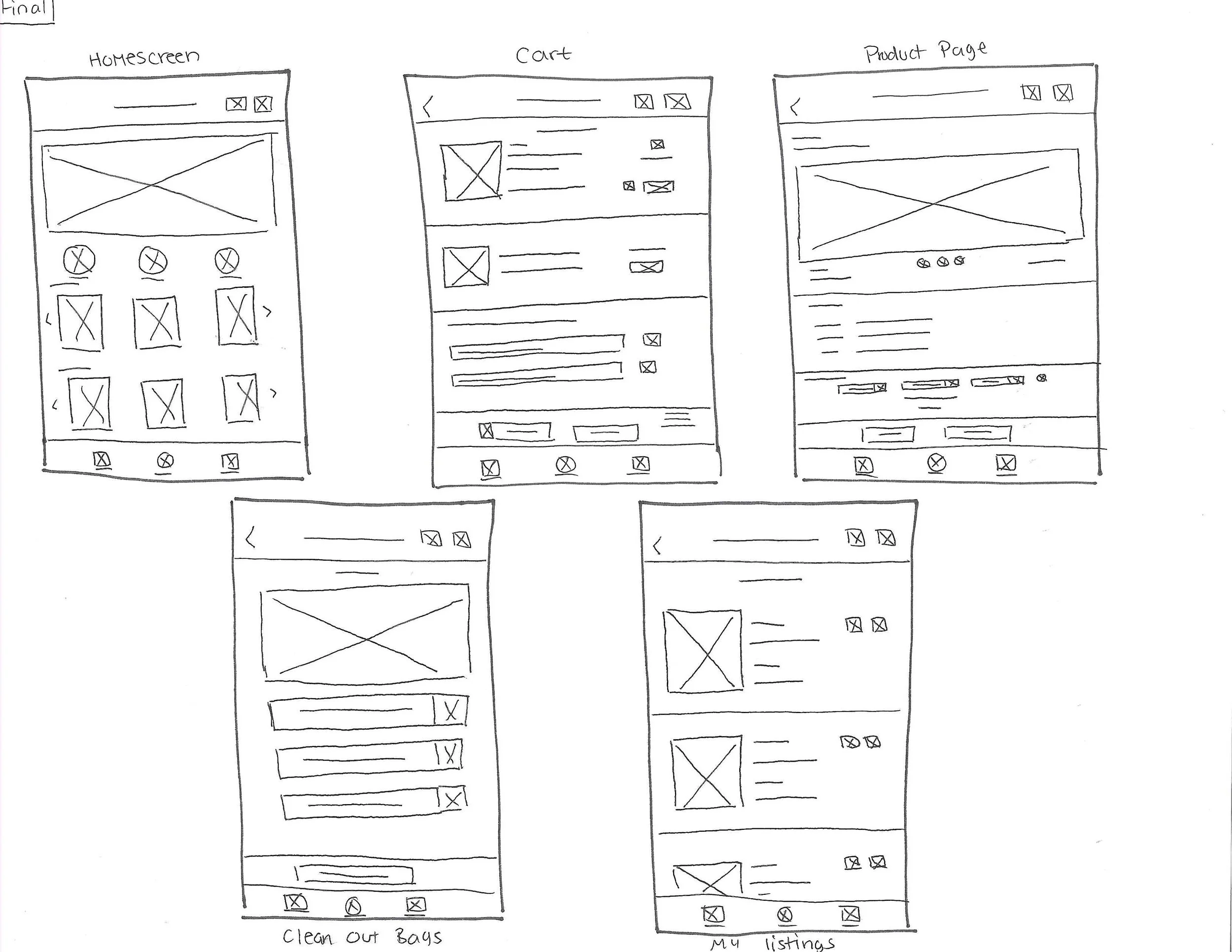
I then moved on to wireframes and started by creating five paper wireframes for each key screen of the app. This allowed me to get all my ideas out and choose the elements I liked most. I then took my favorite elements and combined them to create my final wireframe, which ended up slightly differing from my originally planned user flow.
After finalizing the paper wireframes, I built them out in Figma to create more refined, digital versions. I also took the time to add a few more key screens to allow for a better flow in preparation for the prototype.
Lo-Fi Prototype
Test
Usability Study (Round 1)
I decided to perform a moderated usability study, keeping track of click paths, general observations, quotes, and task completion rates, since I was testing on a low-fi prototype and so that I could ask follow-up questions.
Affinity Diagram
I then created an affinity diagram by adding each observation to a sticky note. Next, I bundled related ideas together which helped me identify five major categories: Likes, Understands, Confusions, Suggestions, Dislikes.
Results
I used the information collected from the affinity diagram to form themes which then helped me form actionable insights. I then used this to iterate on the design. Below are top insights I discovered.
A clearer way to sell clothes on this app is needed.
Updates
Users’ trust needs to be gained in order for them to feel comfortable making purchases on the app.
Usability Study (Round 2)
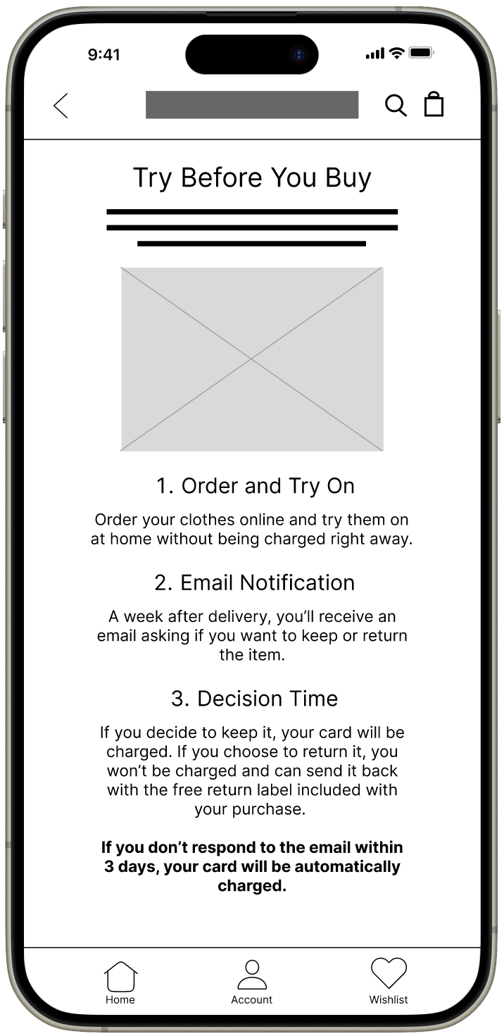
More information and emphasis on the Try Before You Buy feature is needed.
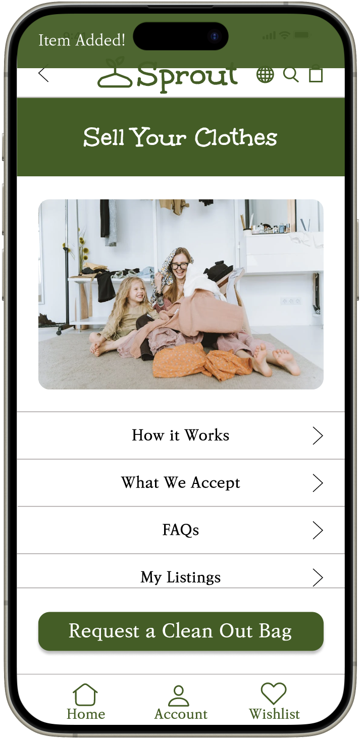
Changed the wording from “Clean Out” to “Sell” to make navigation clearer.
After iterating on the design, I performed another usability study following the same steps from the first round.
Results
I then used the insights discovered to iterate on the design once more, enabling me to create the final hi-fi prototype. Below are top insights I discovered.
Users want a more obvious confirmation when a Clean Out Bag is added to their cart after requesting one.
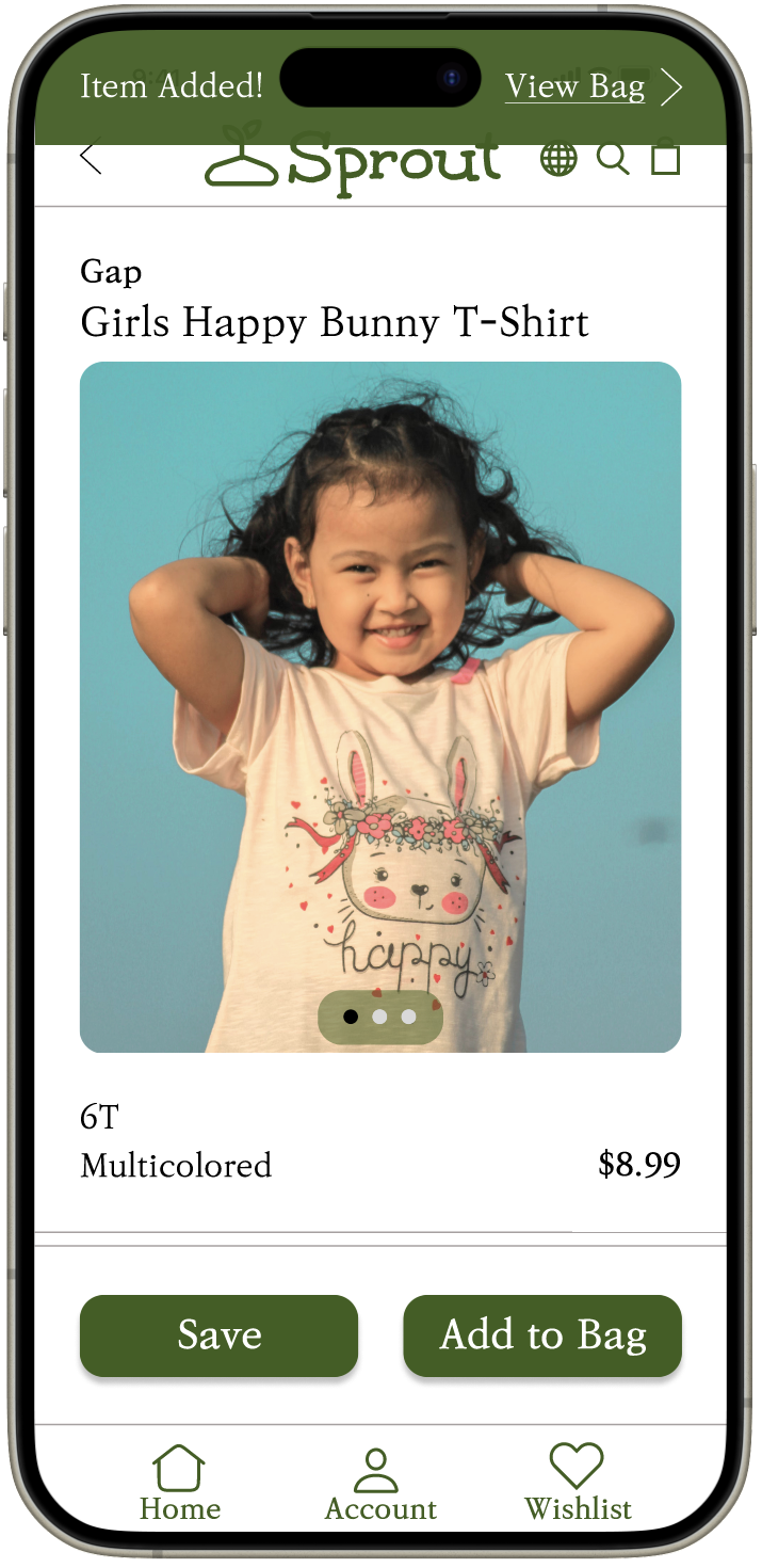
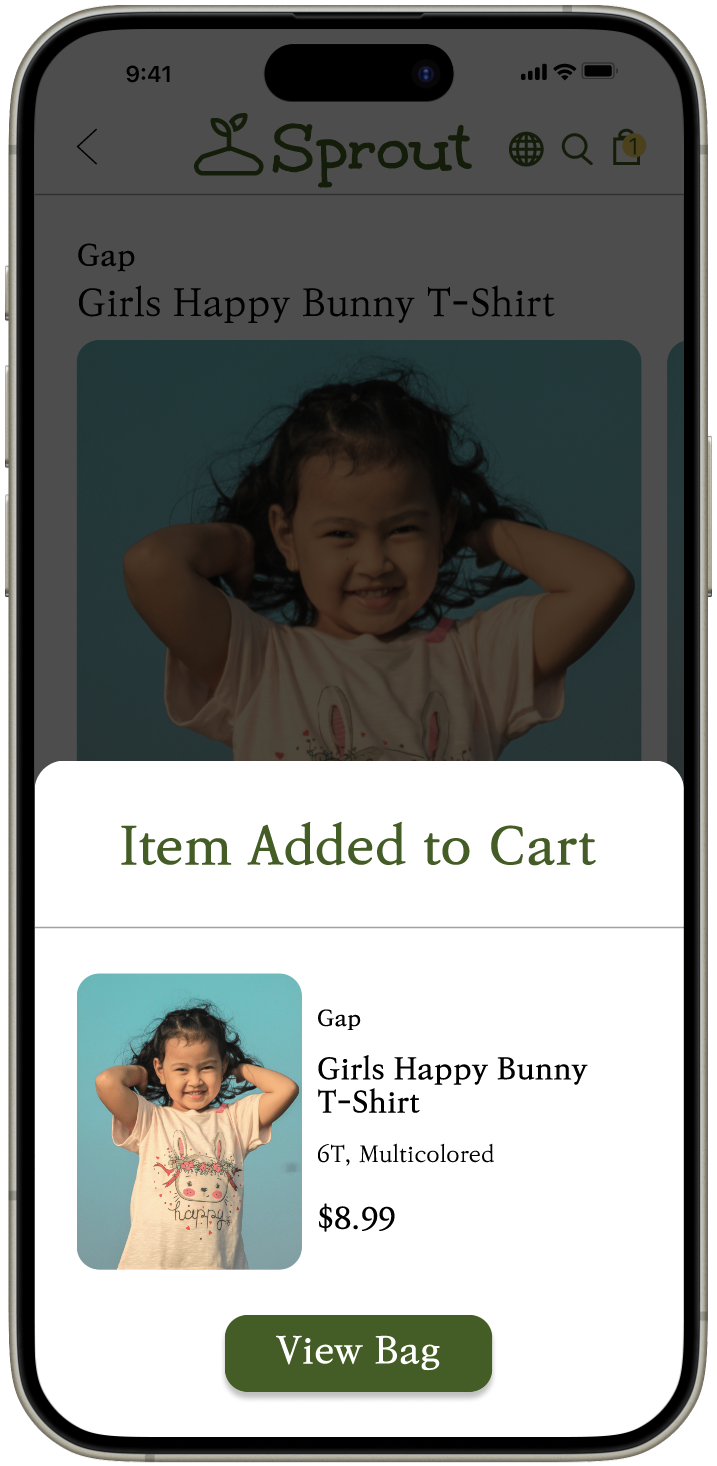
Users want a more obvious confirmation when an item is added to their bag.
Users want to see more personalized size information rather than limited generic size information.
Created a more obvious confirmation after a Clean Out Bag is requested.
Created a more obvious confirmation after an item is added to the cart.
Updates
Below are some before and afters of key updates made. Additional updates are listed in the process deck.
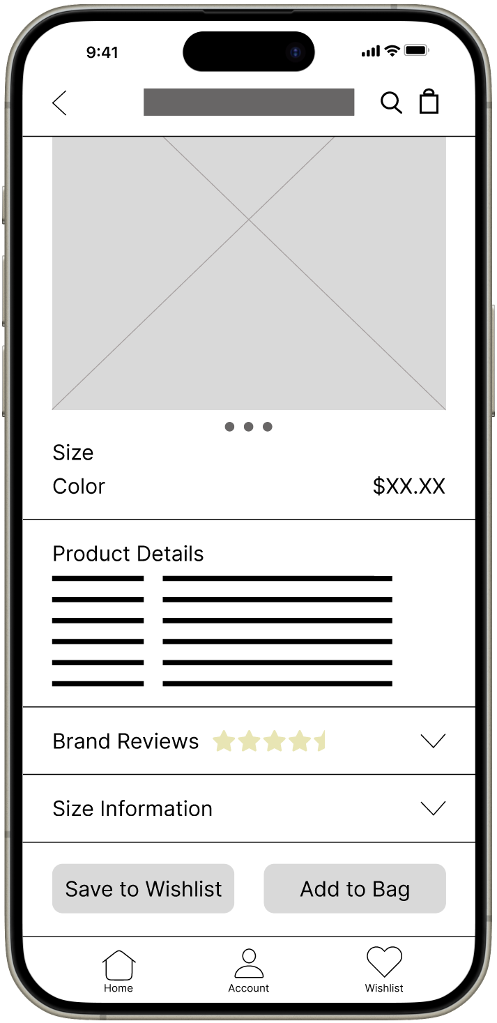
Added a reviews section to build customer trust.
Added an additional page with more information on the Try Before You Buy feature.
Replaced generic size information with a personalized recommendation and additional measurements.
Hi-Fi Prototype
Thoughts
Throughout this project, I gained valuable insights into balancing user needs with functionality and design. Since this was a practice project for my UX Design course, I was unable to validate the effectiveness of the app. Though if this app launched, I would measure it’s effectiveness by conducting additional usability studies and surveys focusing on customer satisfaction with the numerous features. I would also plan on enhancing the app even more by further developing user profiles and a robust recommendation engine.
Overall, this project was an excellent opportunity to apply a full UX Design process. Although it was a practice exercise, it reinforced the importance of research, iterative design, and testing to create meaningful user experiences.

